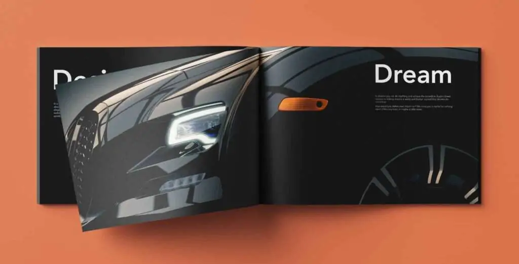
Crafting Impactful Connections with The Art of Brochure Design
At the heart of a compelling brochure lies its design—a meticulous blend of artistry and strategy that transforms a piece of paper or a digital canvas into a captivating narrative. From the classic tri-fold pamphlet to the immersive digital brochures of today, the evolution of brochure design mirrors the shifts in consumer preferences, technological advancements, and the ever-expanding array of platforms for information consumption. While the tactile feel of a well-crafted printed brochure still holds a unique charm, the digital realm has ushered in new possibilities, allowing for interactive, multimedia-rich experiences. In this dynamic landscape, designers find themselves navigating a spectrum that spans traditional print design principles and cutting-edge digital innovations.
“A brochure is like a handshake; it’s your first impression. Make it count with impactful visuals, clear messaging, and a call to action that compels readers to engage.”
– Pamela Wilson, Founder and CEO
Key Elements: Weaving a Visual Tapestry
Layout as a Visual Symphony:
The layout of a brochure serves as a visual roadmap, guiding the reader through the content logically and engagingly. Whether it’s the familiar folds of a printed brochure or the scrolling dynamics of a digital version, a well-designed layout creates a harmonious flow that captures attention and maintains interest.
Typography: The Art of Written Expression:
The choice of fonts, their size, and their arrangement contribute to the overall tone and readability of the content. In the world of brochure design, typography is a powerful tool for conveying the brand’s personality, emphasizing key points, and ensuring that the text is both inviting and digestible.
Color Palette: Infusing Vibrancy and Meaning:
Colors evoke emotions and convey messages without words. A carefully curated color palette enhances the visual appeal and reinforces brand identity. Whether it’s the muted elegance of a corporate brochure or the vibrant hues of a creative endeavor, color plays a pivotal role in shaping the audience’s perception.
Strategic Use of Images and Graphics:
Visual elements breathe life into a brochure. Whether it’s high-quality images, custom illustrations, or strategically placed graphics, these elements serve to complement the text, convey information visually, and create a connection with the audience. In the digital realm, interactive elements and multimedia content elevate the user experience, providing a dynamic and engaging narrative.
Brand Elements: Consistency as the Cornerstone:
For businesses and organizations, maintaining brand consistency is paramount. The integration of logos, brand colors, and other visual elements ensures that the brochure aligns seamlessly with the overall brand identity. Consistency fosters recognition and reinforces brand trust.

Content Hierarchy: Guiding the Reader’s Journey:
The art of designing a brochure involves more than aesthetics; it’s about guiding the reader through a thoughtfully curated journey. Establishing a clear content hierarchy ensures that key messages are highlighted, and information is presented in a manner that captures attention and encourages further exploration.
Whitespace: Balancing Simplicity and Information:
Whitespace, often referred to as negative space, is a design element that is as crucial as the content itself. A judicious use of whitespace prevents visual clutter, allows the audience to focus on essential elements, and enhances overall readability. It’s a silent yet powerful force in effective communication.
Paper and Printing Considerations: Elevating the Tangible Experience:
For printed brochures, the choice of paper type, finish, and printing techniques adds a tactile dimension to the design. The feel of a textured paper or the sheen of a glossy finish contributes to the overall sensory experience, making the brochure not just a visual delight but a tangible one.
Digital Brochures:
In an era where digital experiences shape how we engage with information, digital brochures have emerged as dynamic storytellers. Interactive features, animations, and multimedia content redefine traditional boundaries, offering a more immersive and personalized experience. Scrolling through pages, clicking on embedded links, and watching videos within a digital brochure transform static content into a participatory journey.
Brochures offer a tangible, interactive experience. Invest in quality and design to complement your digital efforts.”
– David Lee, Creative Director
Dark Mode Elegance:
The rise of dark mode in user interfaces has made its way into brochure design. Not only does it offer a sleek and modern aesthetic, but it also aligns with the preferences of users who appreciate reduced eye strain, especially in low-light environments.

Microinteractions: Delight in the Details:
Microinteractions, those subtle animations or responses to user actions, add a layer of delight to digital brochures. From a gentle fade-in of images to interactive buttons that respond to a hover, these micro-interactions enhance the overall user experience.
Minimalism and White Space Redux:
The minimalist design trend, characterized by clean layouts and ample white space, continues to thrive. This approach not only promotes clarity and simplicity but also aligns with the preference for uncluttered, easy-to-navigate digital experiences.
Three-Dimensional Elements: Adding Depth to Visuals:
The integration of three-dimensional elements, whether it’s through illustrations or product visuals, adds depth and visual interest. These elements provide a sense of realism and contribute to a more engaging and memorable digital experience.
In a world where attention spans are fleeting, and information overload is the norm, the enduring power of a well-crafted brochure design lies in its ability to captivate, inform, and leave a lasting impression. Whether it’s the rustle of paper as pages turn or the scroll of a touchscreen, a thoughtfully designed brochure transcends its physical or digital form to become a vessel for storytelling, a catalyst for connection, and a testament to the artistry and essence of design. Navigating the future of communication acknowledges that the brochure stands as a timeless canvas where tradition meets innovation, and where the language of design continues to speak volumes.


