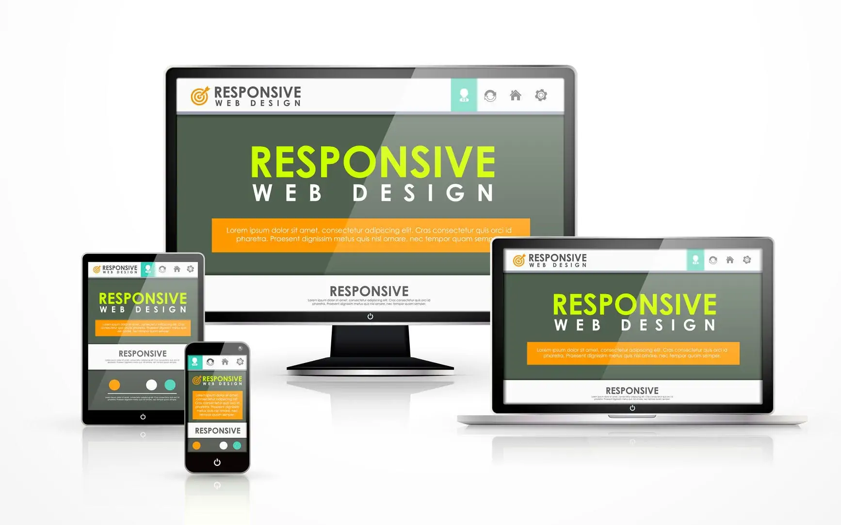
A Comprehensive Exploration of Responsive Web Design
In an era where digital interactions span across an ever-expanding array of devices, Responsive Web Design (RWD) emerges as a crucial paradigm, promising not just adaptability but an enhanced and cohesive user experience. Beyond merely reshaping layouts, RWD stands at the intersection of creativity, technology, and empathy, aiming to transcend the limitations posed by diverse screens and devices. Delving into the intricate layers of this approach, unravel how it seamlessly integrates flexible grids, media queries, fluid images, and thoughtful strategies to create digital spaces that resonate with users on a profoundly human level.
“In the mobile-first world, responsive design is no longer a choice; it’s a necessity.” -Luke Wroblewski, Author
Key Components of Responsive Web Design:
Flexible Grid Layout:
At the core of RWD is a flexible grid system that employs relative units, such as percentages, for layout elements. This ensures dynamic responsiveness to varying screen sizes, accommodating the diverse landscape of devices users engage with.

Media Queries:
Media queries, a cornerstone of RWD, enable the adaptation of styles based on device characteristics. By dynamically responding to factors like screen width and resolution, websites can deliver a tailored experience, whether viewed on a desktop, tablet, or smartphone.
Fluid Images:
The integration of fluid images, achieved through CSS techniques, contributes to a visually consistent experience. Images resize proportionally, preventing distortion and ensuring a harmonious presentation across different screens.
Viewport Meta Tag:
The viewport meta tag plays a crucial role in optimizing the initial scaling and presentation of web pages on mobile devices. This strategic inclusion enhances content visibility and readability on screens of varying dimensions.
Advantages of Responsive Web Design in a Modern Context:
Enhanced User Experience:
RWD, with its commitment to consistency, fosters an enriched user experience by providing seamless access to content and features. This adaptability contributes to increased engagement and user satisfaction.
SEO Excellence:
In the realm of search engine optimization (SEO), responsive design is a strategic asset. Its streamlined structure facilitates search engine crawlers, positively influencing search rankings and visibility.
Cost-Effectiveness and Maintenance Ease:
The cost-effectiveness of RWD lies in maintaining a singular codebase for diverse devices. This not only reduces development costs but also eases the ongoing maintenance burden compared to managing separate solutions.
Future-Proofing Strategies:
RWD is a forward-looking strategy, anticipating the challenges of emerging technologies and devices. Its inherent adaptability positions websites to thrive amidst technological shifts, providing long-term relevance.

Accessibility and Inclusivity:
Beyond technical considerations, RWD contributes to a more inclusive online environment. By accommodating users with disabilities across various devices, it aligns with the principles of digital accessibility.
“Nowadays, responsive design is one of the most significant concepts in web design. It ensures that your website looks great and functions well on all devices, from desktops to tablets to smartphones.” -Google Developers Team
At its core, RWD encapsulates the essence of adaptability, ensuring seamless user experiences regardless of the device at hand. The flexible grid layout serves as the architectural backbone, dynamically responding to the diverse array of screens users interact with daily. Media queries, fluid images, and the viewport meta tag further enrich this experience, offering tailored presentations optimized for various devices.
The advantages of RWD extend beyond technical efficiencies. It champions enhanced user experiences, excels in SEO landscapes, proves cost-effective in maintenance, adopts forward-thinking strategies for the future, and, perhaps most importantly, fosters inclusivity. By accommodating users of all abilities, RWD aligns with the principles of digital accessibility, affirming its role in shaping a more inclusive online environment.
Responsive Web Design not only stands as a current industry standard but also as a compass guiding web development into an era of perpetual technological evolution. Its principles remain foundational, ensuring that websites surpass the expectations of diverse and dynamic digital audiences. In essence, RWD is not just about creating websites; it’s about crafting digital experiences that resonate in a world where adaptability is the key to navigating the responsive future.


