Step-by-Step Guide for How to Evaluate Creative ROI

Creativity fuels every great marketing campaign. From the vibrant graphics that catch the eye to the storytelling that resonates with audiences, creative work is at the heart of brand success. But here is the tricky part. How do you know if all the time, energy, and money you put into creative projects are truly paying off? As marketers, designers, and business owners, we often get caught up in the excitement of launching campaigns without taking a moment to pause and measure the real impact. Understanding the value of creative work is not just about counting likes, shares, or comments. It is about connecting creative output to tangible business outcomes in a way that makes sense for your goals.

Whether you are launching a new brand logo, updating your website graphics, or investing in a social media campaign, knowing how to evaluate creative ROI in marketing ensures every decision you make is grounded in strategy. It also helps justify budgets, optimize future campaigns, and identify areas where creativity truly drives value. Tools like a logo pricing calculator or even a simple graphic design cost estimate guide can help put numbers to ideas and make the evaluation process more transparent. By approaching creative work with a balance of artistry and measurement, you can unlock insights that turn inspiration into results and ensure your investments lead to meaningful growth.

Step 1: Understanding What You Want to Measure

Before you can measure creative ROI, you need clarity on your objectives. Are you looking to increase brand awareness, drive sales, or generate leads? Different goals require different metrics. For example, brand awareness can be measured through reach and engagement, while sales-focused campaigns need conversion tracking. Knowing what matters most to your business ensures that you focus your energy on metrics that reflect true performance.

Step 2: How to Evaluate Creative ROI: Connecting Creative Work to Business Goals

Every creative project should tie back to a larger goal. A social media graphic is not just a piece of art; it should serve a purpose. By linking creative output to measurable business objectives, you can see which campaigns generate meaningful results. Using tools like a graphic design cost estimate helps quantify the investment in each project and compare it against the returns. This approach makes it easier to understand which creative efforts are truly driving value.

Step 3: Measuring Performance Metrics

Once your goals are clear, identify the key performance indicators. Website traffic, click-through rates, lead generation, and social media engagement are common metrics. For visual assets such as logos, a logo pricing calculator can help determine whether the investment aligns with the expected value. Tracking these numbers over time provides a clear picture of performance and highlights trends that inform future campaigns.

Step 4: Calculating ROI

The ROI formula is simple in theory. Subtract the cost of the creative project from the revenue generated and divide by the cost. The challenge is often in assigning value to creative outputs. Consider both direct and indirect impacts. For example, a redesign of your website may not instantly increase sales but could improve brand perception and lead to long-term revenue growth. Using cost tools like a graphic design cost estimate ensures the calculation is grounded in reality.

Step 5: Analyzing Insights and Optimizing

How to evaluate creative ROI: Evaluation is not just about looking at numbers; it is about understanding patterns. Which campaigns exceeded expectations? Which fell short? Learning from these insights allows you to optimize future creative projects. Continuous improvement ensures that your creative investments keep generating increasing returns over time.

Step 6; Communicating Value

Communicating the value of creative work is crucial for evaluating its return on investment (ROI). Stakeholders need context beyond mere numbers to understand the significance of creative investments. It is essential to frame results in relatable terms; for example, linking engagement rates to brand loyalty or potential sales, and utilizing visuals like charts to enhance clarity. Both tangible benefits, such as how a well-designed logo strengthens brand recognition, and intangible benefits, like social media buzz, are important to highlight, as they can have indirect effects on revenue.

Effective communication of creative efforts should be narrative-driven, presenting findings in a storytelling format that includes the problem, the creative solution, the results, and future implications. This humanizes the data and positions creative work as a strategic asset rather than merely a cost. Clear and effective communication builds confidence in creative decisions, encourages future investment, and ensures that the creative team is recognized for contributing to measurable business success.

In the end, how to evaluate creative ROI? Measuring creative ROI may seem challenging at first, but it is an essential step in making marketing investments work smarter. By combining thoughtful strategy, cost awareness, and performance tracking, you can unlock the true value of your creative efforts. Tools like a logo pricing calculator and graphic design cost estimate are more than budgeting aids; they are instruments that help you understand, justify, and maximize the impact of every creative endeavor. With a structured approach, creativity is no longer just an art; it is a powerful driver of measurable success.

Read More

Creative Budgeting for Startups Ready to Scale Sustainably

Starting a new business is thrilling, but it can also feel like walking a tightrope over a pit of uncertainty. You have big ideas, a vision for growth, and the drive to make things happen. At the same time, every dollar counts, and the pressure to stretch resources can sometimes feel overwhelming. This is where creative budgeting for startups becomes more than just a financial exercise. It is a way to take control, make smart choices, and ensure that your growth is sustainable rather than rushed or reckless. Creative budgeting for a startup is not about pinching every penny or cutting corners.

It is about understanding where money is best spent, finding innovative ways to maximize returns, and keeping your team motivated without breaking the bank. Many entrepreneurs think budgeting is a rigid, dull process, but it can actually be a powerful tool to clarify priorities, uncover opportunities, and align resources with your most important goals. Using a startup budget template Excel, or even a simple startup budget example, can transform a chaotic financial picture into a clear roadmap for growth. When done right, creative budgeting can give you the confidence to scale your business strategically and make decisions that benefit both the company and its people.

Why Creative Budgeting for Startups Matters

Every expense, whether large or small, affects your ability to innovate, hire talent, and reach new markets. Creative budgeting for a startup ensures that your limited resources are used efficiently while still supporting essential growth activities. By thinking outside the box and exploring nontraditional ways to allocate funds, founders can avoid unnecessary costs while investing in high-impact areas.

For example, instead of spending heavily on office space early on, a startup might leverage remote work solutions or coworking memberships. Marketing budgets can focus on low-cost digital campaigns, influencer collaborations, or community engagement strategies rather than expensive ads. The key is flexibility and intentionality. Creative budgeting is about finding smarter ways to achieve the same or better outcomes without compromising quality or long-term potential.

Tools That Simplify the Process

Using structured tools can make creative budgeting much more manageable. A creative budgeting for startups template can help track expenses, forecast future costs, and highlight areas where money could be reallocated. A startup budget template Excel, for instance, allows you to visualize financial data clearly, identify trends, and test scenarios before committing funds. With these templates, it becomes easier to communicate financial plans to investors, partners, or team members, making transparency a natural part of your startup culture.

A startup budget example can also serve as a blueprint, showing founders how similar businesses allocate funds to different departments or projects. Studying examples can reveal common pitfalls and inspire innovative approaches that suit your unique circumstances. These tools are especially useful for founders who may not have a formal finance background but want to make data-driven decisions.

Strategies for Creative Budgeting

  1. Prioritize Growth-Driven Expenses
    Focus on spending that directly contributes to scaling the business. This may include technology, marketing campaigns with measurable ROI, or hiring critical team members. Nonessential expenses can be deferred or minimized until revenue stabilizes.
  2. Leverage Free or Affordable Resources
    There are countless free or low-cost tools available for project management, design, analytics, and collaboration. Using these resources wisely can save money while still maintaining professional standards.
  3. Negotiate and Build Partnerships
    Creative budgeting is not only about spending less but also about getting more value. Negotiating with vendors, exploring barter arrangements, or forming strategic partnerships can stretch resources further than traditional budgeting allows.
  4. Monitor and Adjust Regularly
    A static budget is less effective than one that evolves with your startup. Regularly reviewing expenses, comparing them against goals, and making adjustments ensures funds are always allocated efficiently.
  5. Involve Your Team
    Encouraging team members to contribute ideas for cost savings or process improvements not only strengthens the budget but also fosters a sense of ownership and accountability across the startup.

Scaling Sustainably

The ultimate goal of creative budgeting for a startup is sustainable growth. Scaling too quickly without careful planning can lead to cash flow problems, operational stress, or burnout among the team. By approaching growth with a clear understanding of financial limits and creative solutions, founders can expand steadily without jeopardizing the foundation they have built.

For instance, using a startup budget template Excel to forecast multiple growth scenarios allows founders to plan for hiring, marketing, and operational expenses without surprises. Similarly, a startup budget example can provide insights into typical cost structures at different stages, helping to anticipate financial needs before they become urgent problems. Creative budgeting ensures that resources are aligned with strategic priorities, enabling startups to grow confidently and sustainably.

In the end, creative budgeting for startups is more than a finance task. It is a mindset, a strategic tool, and a way to future-proof your business. With the right approach, a startup budget template Excel, and insights from a startup budget example, founders can allocate resources intelligently, explore innovative solutions, and scale without compromising their vision or stability. By embracing creative budgeting, startups can not only survive but thrive, building a foundation for long-term success and sustainable growth.

Read More

Why Leveraging Memes in Brand Creative Builds Instant Connection

Scroll through any social media platform today, and you’ll find that memes have quietly taken over the digital world. They are everywhere on your feed, in your group chats, and even in professional spaces. What started as a fun way for people to share jokes and inside references has now become one of the most powerful tools in modern marketing. The reason is simple: memes feel real. They speak the language of the internet in a way that polished ads rarely can. Audiences today want authenticity more than perfection. They want to see brands that understand their humor, frustrations, and daily experiences. That is where leveraging memes in brand creative makes all the difference. A clever meme can make a brand appear approachable, funny, and in tune with what people care about.

Instead of talking at the audience, it invites them to join the conversation. When a brand shares a meme that captures an emotion everyone relates to, whether it’s the struggle of Monday mornings or the joy of a long weekend, it instantly builds a connection. It feels human, not corporate. It says, “We get you.” This kind of relatability is what turns casual viewers into loyal followers. From social media posts to presentation decks, memes have found their place in marketing strategies everywhere. Leveraging memes in brand creativity PPT slides, or social campaigns is no longer an afterthought; it is a smart way to engage a generation that values humor and honesty.

Leveraging Memes in Brand Creative Reddit: The Human Side of Meme Marketing

At their core, memes are emotional connectors. They express everyday thoughts in funny and familiar ways, and that is exactly what makes them powerful for brands. People relate to memes because they reflect shared experiences. When a brand uses memes thoughtfully, it feels like a friend joining in on a laugh rather than a company trying to sell something.

Memes can make even serious brands feel approachable. A bank using a meme about saving money or a tech company joking about slow Wi-Fi shows personality. It tells audiences that behind the logo, there are real people who understand their world. This simple shift in tone builds trust faster than any slogan can.

On platforms like Reddit, where conversations are driven by humor and authenticity, leveraging memes in brand creativity in Reddit campaigns often works wonders. Communities there appreciate honesty and cleverness, and when a brand joins in with a well-timed meme, it earns credibility. That kind of genuine engagement cannot be forced; it comes from understanding the audience and speaking their language naturally.

Why Memes Build Instant Connection

Memes connect instantly because they work on emotion, not just logic. A meme delivers a message in a few seconds, and it usually makes people smile or laugh. This instant emotional response helps a brand stay memorable. When someone shares a meme from a brand, they are not just spreading an ad; they are spreading a feeling they relate to.

Memes also create a sense of belonging. They make people feel like they are part of a community that “gets” the joke. Brands using memes for marketing can tap into this shared sense of humor to form deeper bonds with their audience. Instead of presenting themselves as outsiders trying to sell, they become insiders sharing the laugh. That subtle shift in perception builds stronger emotional connections and drives more organic engagement.

Creativity Meets Strategy

Using memes effectively demands creative thinking and strategic timing, as their relevance is often fleeting. A successful meme must resonate with the audience and reflect the current cultural context. Incorporating memes into brand campaigns, such as in PPT presentations, can enhance engagement by making complex ideas relatable and infusing personality into standard formats. 

Humor can foster connections even in professional environments and maintain audience attention. However, authenticity is crucial; using forced humor or outdated memes may alienate audiences and damage brand perception. Therefore, brands should choose memes that align with their message and identity, blending fun with relevance for effective communication.

Real World Inspiration

Looking at leveraging memes in brand creative examples, it is clear that humor and cultural awareness can turn an average campaign into something unforgettable. Brands that stay flexible and open to current trends often see the best results. For instance, some beverage companies use memes to playfully respond to online comments, while entertainment brands remix trending formats to promote shows or products.

These examples show how memes can help brands join ongoing conversations instead of creating entirely new ones. It’s not about reinventing the wheel; it’s about joining the moment. The most successful meme campaigns are those that feel spontaneous but still align with the brand’s tone. They make people laugh while staying true to what the brand stands for.

The Balance Between Fun and Authenticity

Memes are most effective when they resonate with authenticity, as audiences can easily detect overly promotional content. Brands should aim to integrate into cultural conversations rather than manipulate them, using humor that comes across as genuine. Memes expressing relatable human experiences, such as the longing for morning coffee or the relief of completing a task, foster immediate connections and encourage audience engagement. 

By demonstrating an understanding of these shared sentiments, brands can cultivate meaningful relationships with their audience. Rather than simply chasing trends, brands utilizing memes in marketing are adapting to contemporary communication styles, as humor serves as a universal language. By engaging sincerely in this medium, brands can build enduring loyalty that extends beyond individual posts or campaigns.

To sum up, memes are more than digital jokes; they are bridges between brands and people. They build instant connections because they speak directly to shared experiences with humor and authenticity. Leveraging memes in brand creative helps brands show their human side and connect with audiences in ways that feel effortless. When used with creativity and sincerity, memes turn ordinary messages into memorable moments, proving that laughter is still one of the most powerful tools in marketing.

Read More

Talked About Illustration Styles Gaining Popularity This Year

Illustration has always been a language of imagination. It is how artists turn thoughts into visuals and feelings into form. Over the years, illustration has evolved from simple sketches to dynamic digital artwork that defines how we see and experience stories, brands, and ideas. The last few years have seen an explosion of creativity, with illustrators combining traditional artistry and digital innovation in exciting new ways. This year, the creative world is buzzing with inspiration. Illustration Styles Gaining Popularity: Artists are experimenting with fresh techniques, new textures, and bold concepts that break away from old conventions. From detailed character artwork to minimalist visuals and dreamlike surreal scenes, illustration has taken on a new role in shaping culture and communication. The creative shift toward individuality and storytelling has never been stronger. 

Illustrators are using their work to express identity, culture, and emotion in ways that feel deeply human. The beauty of this evolution lies in how art reflects society’s changing values. Today, we are drawn to visuals that feel authentic, meaningful, and full of life. This growing demand has inspired a wave of new artistic directions, and many of these are influencing how brands, creators, and storytellers craft their visual worlds. As we look at the most talked-about illustration styles of this year, one thing is clear. Art is not just decoration anymore. It is a language of connection, and it continues to inspire what we see in the trending illustration styles 2025 and the exciting illustration trends 2026 that are already taking shape.

Illustration Styles Gaining Popularity: The Rise of Minimal and Clean Illustrations

Simplicity has become one of the most powerful tools in visual storytelling. Minimal and clean illustrations are gaining popularity because they communicate ideas clearly without overwhelming the viewer. These designs rely on simple shapes, limited colors, and open space to create balance and focus.

In digital branding and user interfaces, this approach feels fresh and easy on the eyes. It helps users navigate visuals comfortably while still adding personality. These modern illustration styles prove that beauty often lies in clarity and restraint. Artists are mastering the art of saying more with less, creating visuals that are both elegant and engaging.

Character Focused Art That Tells a Story

Character-driven artwork is prevalent across various media, including advertising, animation, and social media, as illustrated characters provide identity to stories and brands. These designs are emotionally engaging and relatable. Illustrators are promoting diversity by creating characters that represent various cultures, experiences, and body types, making the art more personal and genuine. With enhanced access to digital tools, artists can create characters with stunning detail that merges realism with imagination. This emphasis on character and emotion is expected to remain a significant trend in illustration through 2026, as audiences increasingly seek connection and authenticity.

Textured and Hand-Drawn Styles Make a Comeback

In contemporary digital art, there is a notable appeal for textured and hand-drawn illustration styles, which provide a more human touch amidst the smoothness of digital visuals. These artworks embrace imperfections, such as visible pencil marks, watercolor strokes, and paper textures, imparting a lifelike quality to each piece. Many illustrators are now leveraging digital brushes that simulate traditional media, enabling them to maintain the warmth of handmade art while benefiting from the versatility offered by digital tools. 

Illustration Styles Gaining Popularity: This blending of old-school charm with modern technology represents a popular trend in types of digital illustration styles. Such an aesthetic underscores a collective longing for authenticity in today’s digital landscape, as audiences increasingly value visuals that convey a sense of personal connection and heartfelt expression, rather than merely polished perfection.

Abstract Expression and Conceptual Design

Abstract and conceptual illustrations are among the most talked-about trends this year. These visuals often blend color, shape, and symbolism to convey feelings rather than literal stories. Artists use them to express ideas that cannot always be captured through words or realism.

This style thrives in editorial design, advertising, and brand storytelling. It allows for creativity without boundaries and encourages viewers to interpret meaning in their own way. Many artists are also merging abstract art with motion design, giving static forms a new sense of energy. These modern illustration styles reveal how creativity continues to evolve through imagination and emotion, not just technique.

3D and Isometric Art Taking the Spotlight

Three-dimensional and isometric illustration styles are growing fast, especially in digital design, marketing, and product visualization. They create depth, movement, and realism that traditional flat art cannot match. The use of light, shadow, and perspective gives a futuristic and professional feel to projects, making them stand out in digital spaces.

Artists use these visuals to make data, products, or environments come to life in engaging ways. From tech companies to creative campaigns, 3D design has become a powerful communication tool. These styles are pushing the boundaries of what digital illustration can achieve and are expected to remain a major influence within trending illustration styles 2025 and beyond.

Bold Colors and Playful Energy

This year has also embraced color like never before. Vibrant, bold palettes are being used to capture attention and evoke joy. Artists are stepping away from muted tones and exploring brighter, more energetic color combinations. These vivid illustrations bring a sense of optimism and excitement that audiences love.

This playful use of color is especially popular in branding and social media design, where standing out visually is crucial. Combined with dynamic composition, this approach keeps illustrations lively, fun, and memorable.

In the end, illustration Styles Gaining Popularity: this year’s most talked-about illustration styles reflect the perfect balance between innovation and emotion. From minimal designs to bold experimental forms, illustrators are redefining how art connects with people. The creative movement celebrates individuality, storytelling, and authenticity in every brushstroke. As artists continue to push boundaries and explore new techniques, these evolving styles will inspire the next wave of visual storytelling and shape the creative landscape well into 2026.

Read More

How Cross-Channel Visual Consistency Shapes Audience Perception

Think about the last time you scrolled through social media, opened an app, or visited a website. Did you notice how some brands just feel right? Their colors, visuals, and tone seem familiar no matter where you see them. That feeling is not an accident; it is the result of cross-channel visual consistency. It is what makes people trust a brand without even realizing it. Humans are visual creatures. We recognize patterns faster than we process words, and our brains naturally connect familiar visuals with reliability and quality. When a brand looks consistent across platforms, it signals stability and professionalism. On the other hand, when visuals shift too often, it confuses the audience and weakens brand perception.

In today’s digital world, people move fluidly between platforms. A customer may first see an Instagram ad, then visit a website, and later receive an email. If each interaction looks different, the connection fades. Cross channel visual consistency creates a thread that ties all those experiences together, making the brand instantly recognizable and emotionally engaging. This article will explore how maintaining a unified visual identity across channels shapes how people see and feel about a brand. It will also discuss why internal and external consistency, as well as standardization and design heuristics, play a crucial role in forming lasting audience perceptions.

Cross-Channel Visual Consistency: The Power of Visual Familiarity

Visual familiarity builds comfort. When people encounter the same design elements repeatedly, they begin to associate them with trust. This is why successful brands invest in a detailed cross channel visual consistency guide. It defines colors, typography, imagery style, and layout patterns that must appear the same across every communication channel. The more aligned the visuals, the stronger the emotional recognition becomes.

A familiar design is like a friendly face in a crowd. It reduces mental effort and reassures people that they are in the right place. When visuals stay consistent across multiple touchpoints, they form a psychological shortcut in the viewer’s mind, linking the brand to reliability and coherence.

Internal and External Consistency Matter

Internal and external consistency are the twin pillars of visual trust. Internal consistency means that every element within a single platform looks harmonious. For instance, all buttons on a website follow the same shape and color scheme, and the typography stays unified throughout. This makes the user experience smooth and predictable.

External consistency expands that concept beyond one channel. It ensures that a user moving from a website to an app or a social page encounters a similar look and feel. That visual bridge strengthens memory recall and reinforces identity. When both types of consistency work together, they give the audience a seamless brand experience that feels natural and dependable.

Why Consistency and Standardization Build Recognition

Consistency and standardization are essential for maintaining a cohesive brand image. Standardization establishes clear rules for the creative process, ensuring that designs, visuals, and messages are aligned. Consistency brings these standards to life, resulting in a recognizable visual language. Without these elements, even the most aesthetically pleasing designs may lose their significance. 

For example, varying shades of the same color across platforms, though seemingly minor, can lead to visual fatigue and confusion over time. By adhering to consistency and standardization, brands can maintain detail orientation from font sizes to image filters. Additionally, these principles facilitate collaboration among teams, such as designers, marketers, and writers, by providing a unified visual framework that supports a coherent brand narrative.

The Role of Consistency and Standards Heuristic

The consistency and standards heuristic is a design principle that emphasizes predictability and clarity. It suggests that users should not have to wonder whether different actions or visuals mean the same thing across platforms. When visual patterns follow familiar rules, users feel confident and in control.

In branding, this heuristic ensures that audiences instantly recognize cues that represent the brand. For example, a brand that consistently uses a circular logo and minimalist design helps people associate that visual with its values. When these elements suddenly change, the audience’s trust may wobble because their mental model of the brand is disrupted.

The heuristic reminds brands that visual patterns must stay intuitive. This means that color schemes, icons, and layouts should not only look beautiful but also behave in ways that match audience expectations. The result is a smoother, more trustworthy user experience.

Emotional Impact of Consistent Visuals

Beyond strategy and design, visual consistency has emotional power. A unified appearance evokes feelings of safety and credibility. People tend to choose brands that feel stable because stability mirrors reliability. This emotional link strengthens loyalty and encourages repeat engagement.

Even subtle consistencies, such as the tone of imagery or rhythm of visual composition, can spark familiarity that feels comforting. It turns an ordinary brand interaction into a moment of connection. Over time, those small visual reinforcements shape how audiences perceive the brand’s personality, values, and authenticity.

Crafting a Cross-Channel Visual Consistency Guide

Every brand that wants to shape perception effectively should invest in a cross channel visual consistency guide. This guide acts as a reference for design teams and marketing partners. It defines how the brand should appear everywhere, from digital ads to printed materials.

A strong guide covers key elements such as logo placement, type hierarchy, color palette, and photography style. It also explains tone and emotion, ensuring that every visual carries the same essence. When this document is updated regularly and used across teams, it guarantees that even as campaigns evolve, the brand remains visually coherent.

In the end, cross-channel visual consistency is not just a design preference; it is a psychological strategy that shapes audience perception. It builds trust, strengthens recall, and turns ordinary visuals into emotional connections. Through internal and external consistency, standardization, and adherence to design heuristics, brands can create experiences that feel both familiar and fresh. When visuals speak the same language across every channel, the audience listens with confidence. They begin to see the brand not just as a company, but as a reliable presence in their digital lives. That is the quiet power of consistency, shaping perception one visual at a time.

Read More

Smart Power of Interactive Packaging & Merch Design

In a world filled with countless brands and endless choices, the competition for attention has never been tougher. People no longer connect with products only for their function; they seek stories, emotions, and memorable experiences. That first physical touch with a product often starts with its packaging, which serves as a silent ambassador of the brand. Once, packaging was purely functional, created to protect and present the product. Now, it has become a creative stage where technology, design, and storytelling come together to spark curiosity and build relationships. This evolution has given rise to a new era known as interactive packaging & merch design.

 It takes the once-static box or label and turns it into something alive, something that communicates, surprises, and involves the customer. Imagine scanning a product and unlocking a digital thank-you message from the creator, or opening a merch box that reveals a hidden code for an exclusive reward. These thoughtful touches transform an ordinary experience into one that feels personal and exciting. Interactive packaging design is changing how brands engage with their audience by blending creativity, emotion, and innovation. It has become more than a trend; it is a strategy that helps brands stay memorable in a crowded marketplace. As we explore its growing influence, we uncover how it turns simple materials into smart tools for storytelling, loyalty, and connection.

Interactive Packaging & Merch Design: The Shift from Ordinary to Engaging

Traditional packaging was designed to inform and protect, but today’s consumers want something more meaningful. They crave interaction and personalization. Brands have realized that packaging can be more than a wrapper; it can be an experience. This shift from static design to interactive expression allows brands to connect on a deeper level with their customers.

By introducing creative features like QR codes, tactile textures, or augmented visuals, interactive packaging invites customers to participate. They are not just buying a product; they are joining a story. This connection triggers emotion and makes the brand memorable long after the purchase.

How Interactive Design Captures Emotion

What makes interactive packaging design powerful is its ability to involve the senses. It combines sight, touch, and curiosity in one cohesive experience. A well-thought-out design can surprise customers and make them feel emotionally connected to a brand. For example, a perfume box that reveals a secret message, or a coffee cup that lets users unlock a playlist, turns everyday moments into enjoyable discoveries.

Emotion is a key driver of brand loyalty. When customers feel joy or excitement while interacting with packaging, they associate those emotions with the brand itself. Over time, this emotional attachment encourages repeat purchases and organic promotion through word of mouth or social sharing.

Merging Creativity with Technology

The allure of interactive packaging stems from its seamless integration of artistry and innovation, utilizing technology to narrate stories and enhance customer engagement rather than merely serving as a gimmick. This type of smart packaging often features scannable elements that direct consumers to distinct digital experiences, such as video tutorials, insights into the product’s creation, or exclusive offers. 

Designers typically start with interactive packaging and merch design templates, which aid in visualizing the interaction between digital and physical aspects while allowing for customization. For small businesses, interactive packaging and merch design free present an opportunity to explore creative concepts with minimal financial risk. Ultimately, this packaging approach transcends mere display; it communicates, entertains, and forges connections, ensuring consumers feel included in a unique experience, thereby enhancing brand recall.

Inspiring Real-World Examples

Several interactive packaging and merch design examples have already proven the power of this approach. From snack boxes that tell jokes when scanned to cosmetic containers that share sustainability tips, brands are using creativity to engage audiences in new ways. Merchandise follows the same path. 

Imagine a shirt that reveals a hidden image through an app or a notebook that links to a digital message of inspiration. These ideas show that interaction does not need to be complex or expensive. Even simple gestures, like including a note that directs customers to share their story online, can create a bond. The secret lies in designing experiences that feel personal and genuine.

Building Connection Beyond the Shelf

Interactive packaging is a potent tool for brands as it extends the consumer experience beyond the point of purchase, fostering continued communication and engagement. After opening a product, consumers are invited to participate through digital interactions, establishing a lasting relationship with the brand. 

This approach also promotes sustainability by encouraging the creative reuse of packaging and providing access to recycling guides, which enhances brand reputation and consumer trust. Additionally, when interactive packaging is paired with merchandise, it transforms each item into a narrative element that embodies the brand’s identity, making consumers active participants in the brand story.

The Future of Smart Interactive Packaging & Merch Design

The future of interactive packaging and merch design looks even more exciting. With the growth of artificial intelligence, augmented reality, and advanced printing technologies, brands will soon be able to offer personalized experiences at scale. A package might adjust its message based on location or season, or merchandise could connect customers to a global digital community.

As more people seek authentic connections, brands that invest in meaningful interaction will stand out. The goal is not just to impress but to express to make customers feel valued and inspired. Interactive packaging design will continue to evolve as an emotional bridge that turns everyday products into memorable moments.

To sum up, interactive packaging & merch design has redefined how brands communicate. It takes something static and turns it into a living experience that speaks directly to the consumer’s emotions. By merging creativity, storytelling, and technology, it transforms ordinary products into unforgettable journeys. Brands can explore this approach using interactive packaging and merch design examples or templates to shape their own identity. With innovation and authenticity, even small businesses can build deep emotional connections that last far beyond the first purchase. The power of this design lies not in the packaging itself, but in how it makes people feel connected, valued, and truly part of the brand’s story.

Read More

How Minimalist Branding Trends Inspire Timeless Identities

In a world filled with endless information, bold advertisements, and fast-changing trends, simplicity has become a quiet revolution. The rise of minimalist design across industries is not just about aesthetics. It represents a shift in how people think, feel, and connect with brands. Consumers today are drawn to authenticity and calmness. They are no longer impressed by loud visuals or overcomplicated designs. Instead, they value clarity, honesty, and emotional depth. The minimalist branding trends reflect this shift perfectly. It focuses on the essential and removes everything that does not serve a purpose. The goal is not to make things plain, but to create meaning through precision and restraint. A minimalist brand invites people to pause, breathe, and focus on what truly matters. 

It feels confident without being loud and strong without being flashy. Think of the clean lines, simple colors, and thoughtful designs that dominate modern packaging and digital interfaces. These are not coincidences. They are deliberate choices that speak to our collective desire for simplicity and balance. Minimalist branding examples show how less truly becomes more when used with purpose. This article explores how minimalist brand trends inspire timeless identities. We will look at why simplicity outlasts trends, how it creates emotional impact, and what makes minimalist brands stand the test of time. Through thoughtful design and clear communication, minimalism helps brands express their core values while building lasting trust with their audiences.

The Essence of Timeless Design

A timeless identity in branding remains relevant across design trends, achieving this through minimalism, which emphasizes clarity and purpose. Minimalist branding strengthens simplicity, focusing on essential elements and eliminating distractions. This approach conveys confidence and consistency, as a clean logo or refined typeface can communicate effectively, leaving room for interpretation. The human preference for order and balance makes minimalist designs both visually and emotionally satisfying. Furthermore, a timeless brand embraces adaptability, as minimalist visuals can evolve without losing recognition. Simple marks or neutral color palettes adjust easily to various mediums, ensuring that minimalism continues to influence strong, enduring identities.

Minimalist Branding Trends: The Emotional Impact of Simplicity

Simplicity in branding communicates intention rather than emptiness, indicating focus and honesty. A brand that adopts minimalism carefully chooses each element color, line, and word to reflect its values, establishing a profound connection with consumers who are overwhelmed by noise and stimulation. Minimalist branding is illustrated through powerful examples where simplicity fosters emotional connections; clean layouts convey trust, balanced compositions evoke calmness, and clutter-free designs allow messages to resonate clearly. Customers perceive minimalist brands as thoughtful and authentic due to their avoidance of excess. Moreover, simplicity enhances recognition, facilitating faster recall of minimalist logos and layouts. This clarity not only builds loyalty but also transforms minimalist branding into a lasting experience, distinguishing it from mere trends.

Why Minimalist Brands Stand Out

In a landscape dominated by vibrant visuals and intricate marketing strategies, minimalism distinguishes itself through its understated nature, effectively capturing attention by offering a refreshing simplicity. This principle of design suggests that in a noisy environment, silence can wield significant influence. A clean, uncomplicated layout exudes boldness through its restraint. Additionally, minimalism conveys a sense of confidence; brands embracing simplicity signal their belief in intrinsic value without relying on embellishments. 

This understated self-assurance resonates with contemporary consumers, who often link minimalism with authenticity, quality, and sophistication. Furthermore, simple designs present practical advantages, as they can be effortlessly adapted across various platforms such as social media, packaging, and digital interfaces. Minimalist approaches preserve clarity and elegance while also promoting resource efficiency, benefiting both time and materials. With an increasing focus on environmental sustainability, the association of minimalism with eco-friendliness enhances its attractiveness in today’s market.

Building Consistency and Recognition

Consistency is essential for a timeless brand, which can be effectively achieved through minimalism, as it promotes a unified visual language. By simplifying the design, brands can maintain a consistent appearance across various touchpoints, enhancing brand recognition and trust through repetition of simple shapes, colors, and typography. This consistency fosters familiarity and reliability, which builds customer loyalty. Furthermore, minimalism enhances storytelling by allowing visuals to support the brand’s message, ensuring clarity and emotional engagement. Each design choice reinforces the narrative, contributing to the timeless appeal of minimalist branding.

The Future of Minimalist Branding TrendsIdentities

As technology and lifestyles evolve, the demand for clarity in branding is increasing, with consumers gravitating towards genuine and uncluttered experiences. This cultural shift suggests that minimalist branding will play a significant role in shaping future brand identities. The strength of minimalism lies in its adaptability to new trends while maintaining core values, allowing brands to remain relevant irrespective of changing visual styles. 

Additionally, minimalism’s alignment with sustainability enhances its importance as it reflects a conscious consumerism ethos, where brands that adopt simplicity are perceived as responsible and ethical. Rather than stifling creativity, minimalist branding refines it, challenging brands to communicate more with less and find beauty in restraint. This intentional approach ensures that minimalist identities continue to resonate and inspire future generations.

To conclude, minimalist branding trends are more than a design choice. It is a philosophy that values clarity, intention, and timeless appeal. By focusing on what truly matters, brands can communicate more effectively and connect more deeply with their audiences. The simplicity of minimalism allows identity to evolve while staying authentic and recognizable. In a world that constantly changes, timeless brands are those that stay true to their essence. Minimalism in branding makes that possible by proving that simplicity, when crafted with purpose, will always remain powerful and enduring.

Read More

Building a Future with Sustainable & Ethical Design Practices

The future of design is not just about beauty, technology, or innovation. It is about purpose. Every product we use, every space we live in, and every interface we interact with shapes the kind of world we create. In today’s rapidly changing environment, design holds incredible power, not just to inspire but to influence how we treat our planet and each other. This is where sustainable & ethical design practices come in. It is more than a creative trend, it is a cultural shift that calls for responsibility, empathy, and awareness.

Designers, brands, and consumers are beginning to see that creativity must serve more than commercial goals. It should reflect compassion for people and respect for nature. Sustainable design looks at how to use materials wisely, minimize waste, and create with longevity in mind. Ethical design focuses on fairness, transparency, and integrity in the way things are made and used. Together, they form a philosophy that connects creativity with conscience.

This mindset asks one simple question before creating anything new: will this make the world a little better? Whether it is through fashion that avoids harmful dyes, digital tools that respect privacy, or buildings that use renewable energy, sustainable and ethical design proves that innovation can go hand in hand with kindness. This approach invites us all to think, feel, and act with purpose, building a future where design not only looks good but does good too.

The Essence of Sustainable & Ethical Design Practices

Sustainable and ethical design begins with awareness and empathy. It asks creators to look beyond short term goals and consider the lasting impact of their work. Sustainability is about designing systems that can exist in harmony with nature. Ethical design is about ensuring that human rights and wellbeing are never compromised. Together, they form a powerful framework for creating meaningful and responsible solutions.

When designers use renewable materials, reduce waste, and design products that last, they contribute to sustainability. When they ensure fair labor, honesty, and inclusion, they embrace ethics. These choices define the values behind the work. Sustainable and ethical design practices examples can be found in every industry, from fashion brands using natural fibers to digital designers creating accessible interfaces for all users.

The Role of Ethical Principles in Design

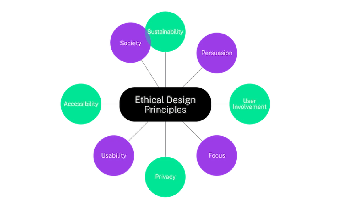
Ethical design principles guide the moral side of creativity. They help designers stay true to values such as respect, honesty, and equality. These principles remind us that design influences how people think, behave, and feel. When applied carefully, they help create experiences that are not only functional but also fair and empowering.

Many professionals and students refer to educational resources like a design ethics PDF to understand how moral decision making shapes design. Such resources provide frameworks for evaluating whether a product respects privacy, promotes safety, and avoids manipulation. Ethical design examples include websites that protect user data, companies that promote accessibility for all users, and products that are produced under fair working conditions. These examples show how ethics and creativity can coexist in harmony.

The 7 Principles of Sustainable Design

At the foundation of sustainability lies a well recognized framework known as the 7 principles of sustainable design. These principles include efficiency, conservation, adaptability, durability, renewability, waste reduction, and social responsibility. They help designers think holistically about the life cycle of their creations.

A designer who focuses on efficiency might find ways to use fewer materials without sacrificing quality. Someone guided by adaptability might design modular furniture that can be reassembled instead of discarded. Durability encourages long lasting design, while social responsibility ensures fairness and positive community impact. When these principles are combined, they create a design process that respects both people and the planet.

Real World Applications of Ethical and Sustainable Design

The beauty of ethical and sustainable design is fundamentally rooted in its practicality, which manifests in everyday applications. It encompasses fashion designers who create collections from recycled materials, architects who design buildings harmoniously integrated with nature and utilize solar energy, and digital creators who develop inclusive and transparent tools. These instances exemplify how thoughtful creativity can contribute positively to sustainability. 

Furthermore, ethical design extends into technology, emphasizing accessibility for individuals with disabilities and ensuring user-friendly digital interfaces. In product design, there is a pressing shift towards reducing plastic packaging and investing in recyclable alternatives, illustrating that ethical considerations can profoundly enhance innovation across various industries. This transformation highlights that ethics and sustainability are not mutually exclusive with creativity and advancement; rather, they can lead to a reinvented and responsible design ethos across sectors.

Sustainable & Ethical Design Practices: The Power of Design to Shape the Future

Design possesses the power to instigate change, shaping perceptions and beliefs about what is achievable. Designers who prioritize sustainability and ethics redefine what constitutes success, shifting the focus from mere profit to impactful and integrity-driven outcomes. Every decision in design becomes a chance to promote protection, education, and inspiration. Adopting ethical design principles signifies taking responsibility, where designers engage with empathy, honesty, and purpose. 

The roadmap for the future of design is paved by those who recognize that true progress is measured not just by technological strides but by the positive legacy they leave for future generations. Creating this future necessitates collaboration among designers, businesses, and consumers, with each stakeholder playing a crucial role. Support for sustainable brands, demands for transparency, and the appreciation of durable quality foster more ethical production, thus perpetuating a cycle of care that enhances the relationship between creativity and responsibility.

In the end, building a future with sustainable and ethical design is not an impossible dream. It is already happening, quietly shaping the way we create, buy, and live. The more designers embrace sustainability and ethics, the more positive change we will see in every part of our lives. It is a reminder that design is not just about how things look, but about how they make people feel and what they mean for the planet. By learning from ethical design principles, exploring sustainable & ethical design practices examples, and following the 7 principles of sustainable design, we can make creativity a force for good. Every thoughtful design decision, no matter how small, becomes a step toward a kinder, cleaner, and more conscious world. The future of design is not just sustainable or ethical, it is beautifully human.

Read More

Micro-Animations and UI Microinteractions That Captivate Users

Think about the last time you used an app or website that just felt right. The buttons responded smoothly. The loading icon gently danced while you waited. The menu subtly shifted when you tapped it. You may not have noticed it consciously, but these small touches made your experience more enjoyable and natural. Those tiny moments of motion and response are not accidents. They are crafted with care through micro-animations and UI microinteractions. In a world where users move fast and expect digital experiences to feel alive, these small yet powerful details can turn an ordinary interface into something delightful. They guide, reassure, and reward users without demanding attention. 

When a heart icon fills up after a click or a button ripples softly under your fingertip, you are experiencing design magic that bridges function and emotion. People are drawn to interfaces that feel human. Micro animations and UI microinteractions bring that sense of personality and playfulness that users crave. They make technology feel less mechanical and more conversational. The smallest animation can express friendliness or trust. The tiniest interaction can reduce confusion and make navigation feel effortless. This article will explore how these subtle details enhance digital experiences, look at micro interactions examples that inspire creativity, and understand how designers use them to build interfaces that connect instantly with users.

Micro-Animations and UI Microinteractions: The Beauty of Small Details

Micro animations and UI microinteractions examples are like the facial expressions of digital design. They might seem minor, but they communicate powerful messages. Think of them as a designer’s way of saying, “I see you. I’m listening to you.” For instance, when a user completes a task and a small checkmark pops up with a quick bounce, it gives instant feedback. It tells the user that the action was successful and adds a sense of satisfaction. 

Such small cues create a smooth emotional flow through the interface. These animations also reduce cognitive load. Instead of reading instructions, users can follow motion cues that show what just happened or what to do next. This makes the journey intuitive without cluttering the screen with text or pop-ups.

Micro Interactions Examples That Make an Impact

Micro interactions websites in digital communication can enhance user experience. For instance, on social media, a heart-like heart appears when a photo is double-tapped, creating a playful and emotional connection. On e-commerce websites, a smooth cart icon animation conveys a sense of accomplishment, without words. In messaging apps, soft typing indicators create anticipation and humanize waiting times. Designers often experiment with micro interactions to turn routine actions into delightful experiences, such as hover effects, animated icons, progress bars, and swipe transitions. The magic lies in their timing, rhythm, and subtlety, making digital communication feel more real and alive.

Designing Emotion Through Motion

Micro animations in UI design are not just about movement but also storytelling, balancing function with emotion. Designers use these animations to create a sense of realism and physicality, mimicking natural motion. The secret is to use motion as feedback, not decoration, and respond intuitively to user actions. This visual language helps users predict results and understand relationships between elements, turning complex processes into smooth, enjoyable experiences.

Micro Interactions UI Examples That Inspire Creativity

Micro interactions in user interfaces (UI) can be transformed into charm through creativity. Password input fields with animated hints and scroll indicators create a sense of momentum and flow. Web designers use subtle hover effects to give users gentle feedback, inviting interaction and curiosity. Even loading animations, like bouncing dots or rotating elements, keep users engaged during wait times. These thoughtful details add warmth and personality to digital spaces, transforming a flat interface into an interactive companion. Overall, these details create a more engaging and enjoyable experience for users.

How to Use Micro Animations UI in Modern Design

Integrating micro animations UI into a project requires sensitivity. The goal is not to overwhelm the user but to enhance usability and enjoyment. Here are some ways designers achieve that balance.

  1. Provide Feedback: Every action should have a visible response. A soft pulse or slide can confirm that something has been clicked or moved.
  2. Guide Attention: Motion can direct users toward key actions or new content. For example, a slight shimmer on a call-to-action button can gently attract focus.
  3. Show Progress: Instead of static bars, animated loaders keep users engaged.
  4. Build Personality: Small, consistent motions can reflect brand identity. A playful brand might use bouncy transitions, while a luxury brand might prefer slow, elegant fades.

Why Micro-Animations and UI Microinteractions Matter

In the digital world, attention is fragile. Micro animations and UI microinteractions hold their attention by making every moment feel responsive and alive. They create rhythm, continuity, and emotion, which turn basic usability into genuine engagement. These tiny design moments remind users that their actions matter. They bring clarity to interactions, reduce uncertainty, and make technology feel approachable. Whether it’s a soft bounce, a glow, or a quick fade, each micro movement strengthens the bond between human and machine. Designers who master these details create experiences that linger in memory. People may forget the layout or the text, but they will remember how smooth and satisfying it felt to use.

To sum up, micro-animations and UI microinteractions are more than decorative effects. They are expressions of care and empathy in design. They make digital experiences intuitive, joyful, and deeply human. Every click, tap, or swipe is an opportunity to connect with the user emotionally. With thoughtful motion and subtle feedback, designers can turn even routine tasks into moments of delight. In a world overflowing with digital noise, it’s often the smallest movements that speak the loudest.

Read More

Visual Storytelling in Brand Campaigns Shapes Modern Marketing

In today’s world of endless scrolling, flashing screens, and shrinking attention spans, brands have to do more than simply advertise. They need to connect, inspire, and stay memorable in a sea of competition. Consumers are no longer drawn to cold facts or catchy slogans alone. They crave meaning, emotion, and authenticity. That is why visual storytelling has become one of the most powerful tools in modern marketing. It transforms how brands communicate and how audiences respond. Visual storytelling in brand campaigns essay brings emotion to life. It allows brands to show rather than tell, to express who they are through colors, imagery, and motion that evoke feeling. 

When people see a story rather than hear a sales pitch, they are more likely to remember it and to trust the brand behind it. Whether it is a heartfelt short film, an inspiring social media post, or a simple image that captures purpose, the impact of visuals is unmatched. This new form of storytelling is not about perfection. It is about being real. When audiences see honest, creative visuals that reflect shared values, they feel seen. That emotional connection builds loyalty that money alone cannot buy. Today, visual storytelling is more than a creative strategy; it is the heartbeat of modern marketing. It shapes how people perceive, remember, and choose brands, making it essential for anyone looking to leave a lasting mark in a visual-first world.

The Power of Story in a Visual World

Visual storytelling gives life to a brand’s personality. Instead of relying on long explanations, it turns complex ideas into experiences people can instantly understand and feel. The beauty of this approach is that it works across every platform from short-form videos to large-scale campaigns. A well-crafted visual story can move people emotionally in seconds and make a brand unforgettable. Every image, color, and movement plays a part in how a story is told. Bright tones can communicate energy and optimism, while muted shades convey calm and trust. 

The way these elements come together shapes perception without a single word. The importance of visual story telling in brand campaigns lies in this emotional power. It creates a deep connection that plain text or data can never achieve. When used with purpose, visual storytelling transforms marketing into something meaningful. It becomes an art of empathy showing the audience that the brand understands their emotions, challenges, and dreams.

Visual Storytelling in Brand Campaigns: Bringing Stories to Life

Great marketing begins with great storytelling, and visuals are the most direct path to emotion. The most memorable visual storytelling in brand campaigns examples often center on human experiences rather than products. A campaign showing a simple moment of kindness or courage can inspire stronger loyalty than any technical description ever could. These examples teach us that emotion drives memory. People may forget statistics, but they never forget how a story made them feel. 

This is why successful brands invest time in crafting authentic, relatable stories that visually express their identity and purpose. Even a single photograph can tell a powerful story. A close-up of hands working, a landscape showing renewal, or a portrait that captures joy all these visuals can communicate a brand’s values instantly. They build trust by showing rather than telling, which is what makes visual storytelling so influential in shaping modern marketing.

The Importance of Consistency and Design

Strong visual storytelling is not random. It requires structure and consistency. This is where visual story telling in brand campaigns template becomes valuable. A template acts as a creative guide that helps maintain uniformity across campaigns. It may include color palettes, image styles, typography, and visual themes that align with the brand’s voice. This consistency is crucial because audiences recognize familiarity. When they repeatedly see visuals that feel like the brand, it strengthens trust and recall. 

The template also helps creative teams work more efficiently by providing clear direction. It ensures that every campaign, regardless of platform, carries the same emotional tone and identity. With a clear visual framework, brands can innovate confidently while staying true to their message. Consistency does not limit creativity; it enhances it by ensuring that every visual piece contributes to a larger, unified story.

Lessons from Real Brand Storytelling Examples

Brand storytelling is a powerful tool for building emotional depth in campaigns. It highlights values like courage, hope, and inclusion, and uses visuals to celebrate real people and their stories. This connection leads to loyalty, as people buy into a brand’s beliefs. Visual language can cross borders and cultures, allowing brands to reach diverse audiences without losing emotional depth. Examples of successful brand storytelling demonstrate how visuals can build emotional depth and connect with audiences.

The Role of Visual Storytelling in Strategy

Visual storytelling is a strategic approach that combines creativity, psychology, and communication science to create engaging and impactful brand campaigns. It guides viewers’ emotions through every aspect of the image, from photo angles to video rhythms. This method shapes modern marketing by allowing audiences to feel involved and share their experiences. Visual storytelling complements digital marketing, as it connects people to brands quickly on social media and online platforms. A strong story can turn a simple ad into a conversation, a post into a movement, and a viewer into a loyal supporter.

To sum up, visual storytelling is the soul of modern marketing. It blends art, empathy, and strategy to create campaigns that truly resonate. By using visuals to tell stories of purpose and humanity, brands go beyond advertising and build relationships. Through consistent design, emotional depth, and authentic expression, visual storytelling in brand campaigns template continues to shape how people see and remember brands. In a world that forgets fast, it is the stories we see and feel that last forever.

Read More