
What Is Responsive Web Design and Why Your Website Needs It Now
Picture this. You visit a website on your phone, and the text is so tiny you have to zoom in just to read it. Then you tap a button, and it takes you to the wrong page because everything is squeezed into one small space. Frustrating, right? Now imagine doing that on a tablet, and it looks slightly better, but still not right. The magic of responsive web design enters the picture here. Smart layout design is not just a trend; it is a must for every modern website. People use phones, tablets, laptops, and even smart TVs to browse the internet. Your website needs to adapt to all these screens automatically. If it does not, you are losing visitors before they even have a chance to read what you offer.
What makes smart layout design so essential today is user behavior. Most people browse the web on their phones more than any other device. A non-responsive site looks outdated and unreliable, while a responsive one feels smooth, modern, and welcoming. Whether you run a small blog or an online store, a responsive layout helps keep visitors engaged and coming back. This article will help you understand what smart layout design really means, how it works, and why it is vital for your success online. We will also look at practical examples, tools, and resources that can help you learn and apply it easily.
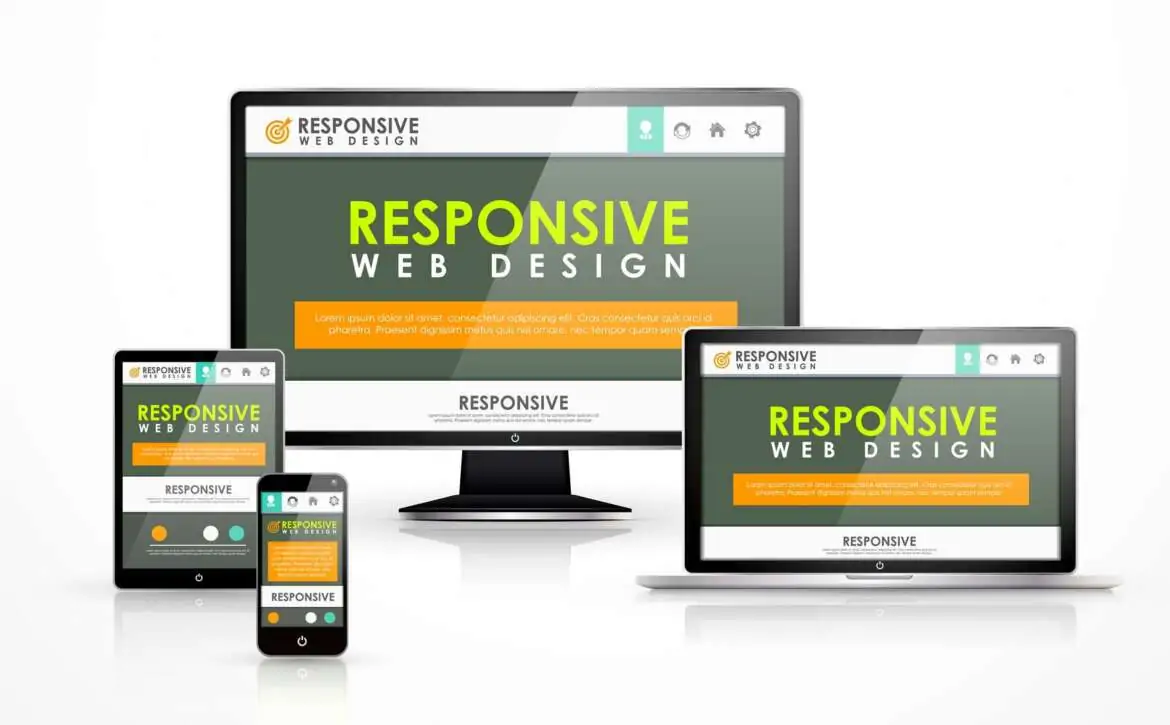
What Is Responsive Web Design?
Smart layout design is a technique that allows a website to automatically adjust its layout and content based on the device being used. Instead of creating separate versions of your site for phones, tablets, and desktops, one single design adapts fluidly to all screen sizes. It achieves this flexibility through CSS (Cascading Style Sheets), which control how elements like images, text, and navigation appear. If you have ever explored a smart layout design book or taken a smart layout design course, you might have learned about concepts like flexible grids, media queries, and fluid images. These are the backbone of creating a design that looks perfect on every screen. For instance, when a visitor opens your website on a large desktop screen, the content spreads comfortably across the page. When the same page loads on a mobile device, it reorganizes itself so the user can scroll smoothly and read without zooming. It is a simple concept, but one that makes a world of difference in how people experience your site.
Why Smart layout design Matters
Responsive Web design freecodecamp is not only about appearance. It affects performance, accessibility, and even search engine rankings. When your site loads properly on any device, visitors stay longer and interact more. Search engines recognize this and rank responsive websites higher because they deliver better user experiences. You want guests to feel comfortable, no matter how they enter. If your website only looks good on a computer but feels broken on a phone, you are turning away a large portion of your audience. Another important reason to focus on responsiveness is speed. A good responsive design ensures faster loading times on mobile networks. People rarely wait more than a few seconds for a page to load. If it takes too long, they leave. With responsive design, your content adjusts to load efficiently, keeping visitors satisfied.
Real Life Responsive Web Design Examples
If you are looking for smart layout design examples, think about major news outlets or e-commerce sites that look seamless on every device. These websites automatically adjust columns, images, and menus depending on screen width. When you rotate your phone, the layout changes instantly. You can explore several online showcases that demonstrate how flexible layouts transform user experience. They show side-by-side comparisons of responsive and non-responsive versions, which clearly display how powerful this design method can be. By studying these examples, you can get fresh ideas for your own projects.
Learning and Practicing Smart Layout Design
The text emphasizes that individuals do not need coding expertise to begin learning web design, highlighting various accessible resources. The Smart layout design course offered by FreeCodeCamp is recommended as a beginner-friendly, interactive option that guides users through HTML and CSS layout creation. Additionally, reading responsive web design books can enhance understanding of professional principles, strategies, coding techniques, and visual examples. Key CSS properties to focus on include flexbox, grid layout, and media queries, which help manage content across different screen sizes. Engaging in small projects or enrolling in a course can further build confidence and skill refinement over time.
Responsive Web Design CSS
At the heart of Smart layout design lies CSS. This powerful language lets you define the rules for how your website should appear on different devices. With CSS, you can set flexible containers, adjust font sizes, and scale images so that nothing looks awkward. For example, media queries in CSS help your website detect the screen size and apply specific styling rules. You can set one layout for screens wider than 1024 pixels and another for smaller ones. This adaptability ensures that every user enjoys a consistent experience, no matter their device. The more you explore CSS, the more control you gain over how your website looks and feels. A few hours of experimenting can transform a plain design into one that feels modern and intuitive.
In the end, responsive web design course has become essential in the contemporary digital environment for bloggers, business owners, and developers alike. It ensures that websites adapt seamlessly to various screen sizes, facilitating user trust and engagement. A well-optimized site enhances user experience through smooth navigation, readability, and fast loading times, which also positively impacts search engine rankings. Numerous accessible resources, such as FreeCodeCamp tutorials and comprehensive online courses, are available for learning. Now is an ideal time for those not yet optimized to start enhancing their sites by experimenting with CSS and analyzing practical examples. Embracing responsive design transforms digital experiences, fostering a genuine connection with audiences across all devices.